Google Product Icons
Unifying a disparate brand
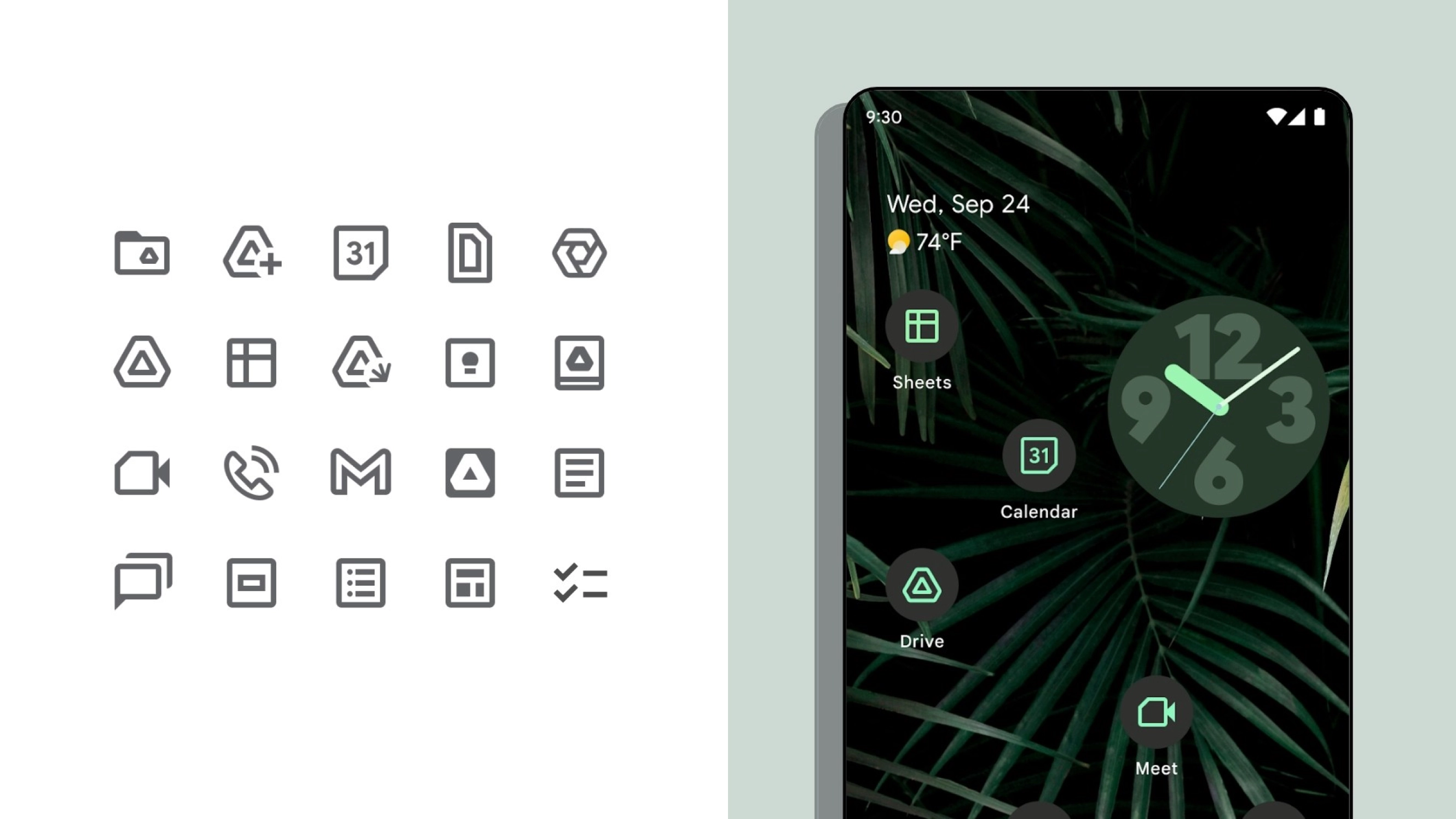
Google has hundreds of beloved products with identities that have individually evolved over time. This identity sprawl, compounded by Google’s decentralized structure, spawned a disconnected aesthetic system amongst this huge family of products.
We led the redesign of Google’s product icons to irrefutably embody the Google brand. Our redesign strategy was rooted in user research and insights, focusing on Google’s iconic color palette to cohesively unite the product and create a visually connected family.
However, just creating a visual system was not sustainable at the scale of Google. So we established “Brand Sprints” as a scalable guide for marketing and product teams across the entire 150,000+ organization.